

https://cyclopsprintworks.com/products/ ... le-regular

https://cyclopsprintworks.com/products/ ... tom-whalen
Art discussion forum.


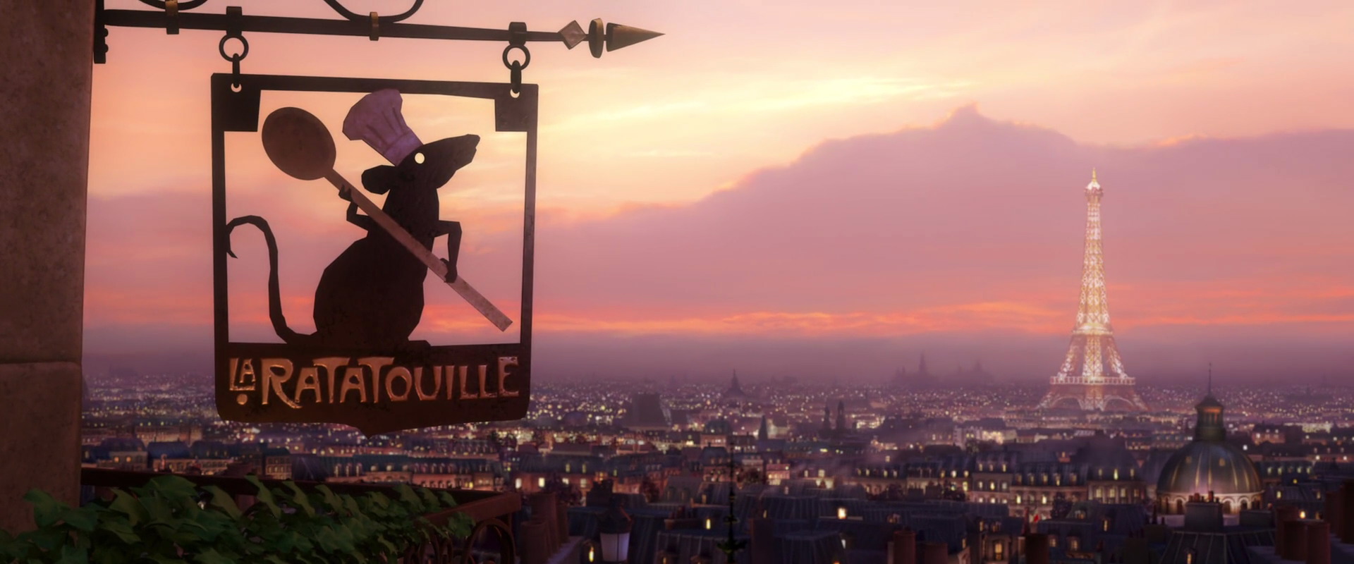
Interesting. I don't find Robin Hood or Inside Out to be all that different from the non-Cyclops Disney stuff - Inside Out in particular has a range of colors there, and Robin Hood feels like it fits with the range presented from the movie (with the greens seeming to pop more on a well-chosen gold variant). But I definitely see the point with respect to Ratatouille - matches the Duel at Dawn design in terms of the chosen color scheme, which seems to favor a more monochrome approach. Not my thing personally, though cool if it's other people's. Just curious as to the reasoning behind that approach on something like Ratatouille - a film that I'd agree with RA in that it has one of the best color palettes among the Pixar films.RottenAtom wrote:Been waiting for a Whalen Ratatouille for awhile. Not a huge fan of this. The art is cool, but Ratatouille has the best color palette out of all the Pixar movies and I think not utilizing it is a missed opportunity.
Not trying to hate, but in my opinion the Cyclops posters by Tom aren't on the level of his other Disney posters (they were all fire before Cyclops got involved). I would love re-dos of Robin Hood, Ratatouille, and Inside Out. Love Whalen, love the movies, don't care for the posters or color choices.
35mmpaul wrote:We are addicted to things that hurt our butts.
The Inside Out poster is extremely white. That movie is full of bright, bold, beautiful colors in every frame and I don't get any of that from the poster. I get lots of white with a little bit of color mixed in. Not a fan of the girl's face all big like that. It just isn't an appealing poster to look at and I'm not a fan of the layout. That movie is super colorful and I wish the poster reflected that (needs more purple). The print has a lot of orange in it. The Robin Hood poster is also overwhelmingly orange and it doesn't have the colors that I remember from the movie (needs way more green). I wish he took a similar approach to Inside Out as he did with Finding Nemo. With Nemo being submerged in water, the print benefited from the non-white background in a way that I think Inside Out would've since it is submerged in the human mind.jkw3000 wrote:Interesting. I don't find Robin Hood or Inside Out to be all that different from the non-Cyclops Disney stuff - Inside Out in particular has a range of colors there, and Robin Hood feels like it fits with the range presented from the movie (with the greens seeming to pop more on a well-chosen gold variant). But I definitely see the point with respect to Ratatouille - matches the Duel at Dawn design in terms of the chosen color scheme, which seems to favor a more monochrome approach. Not my thing personally, though cool if it's other people's. Just curious as to the reasoning behind that approach on something like Ratatouille - a film that I'd agree with RA in that it has one of the best color palettes among the Pixar films.RottenAtom wrote:Been waiting for a Whalen Ratatouille for awhile. Not a huge fan of this. The art is cool, but Ratatouille has the best color palette out of all the Pixar movies and I think not utilizing it is a missed opportunity.
Not trying to hate, but in my opinion the Cyclops posters by Tom aren't on the level of his other Disney posters (they were all fire before Cyclops got involved). I would love re-dos of Robin Hood, Ratatouille, and Inside Out. Love Whalen, love the movies, don't care for the posters or color choices.
FYI, I've been told that Eclipse is not longer a separate entity, and has effectively been absorbed into Cyclops proper. I asked about it when I started seeing "Printed by Cyclops Print Works" instead of Eclipse Workshop on recent listings (and wanted to make sure I had the correct info for the DB).Kramerica wrote:Aside from the fact that the stuff printed by Eclipse is head and shoulders above d&l quality wise.
I was curious about that wording as well.mfaith wrote:FYI, I've been told that Eclipse is not longer a separate entity, and has effectively been absorbed into Cyclops proper. I asked about it when I started seeing "Printed by Cyclops Print Works" instead of Eclipse Workshop on recent listings (and wanted to make sure I had the correct info for the DB).Kramerica wrote:Aside from the fact that the stuff printed by Eclipse is head and shoulders above d&l quality wise.

Codeblue wrote: I’m sorry for everything.
Variant looks like if the reg was left out in direct sunlight for a few years.earlgreytoast wrote:The regular is fine but jeez, what’s the point of having a variant that is so similar and bland? Boring af. I love the design.

35mmpaul wrote:We are addicted to things that hurt our butts.


