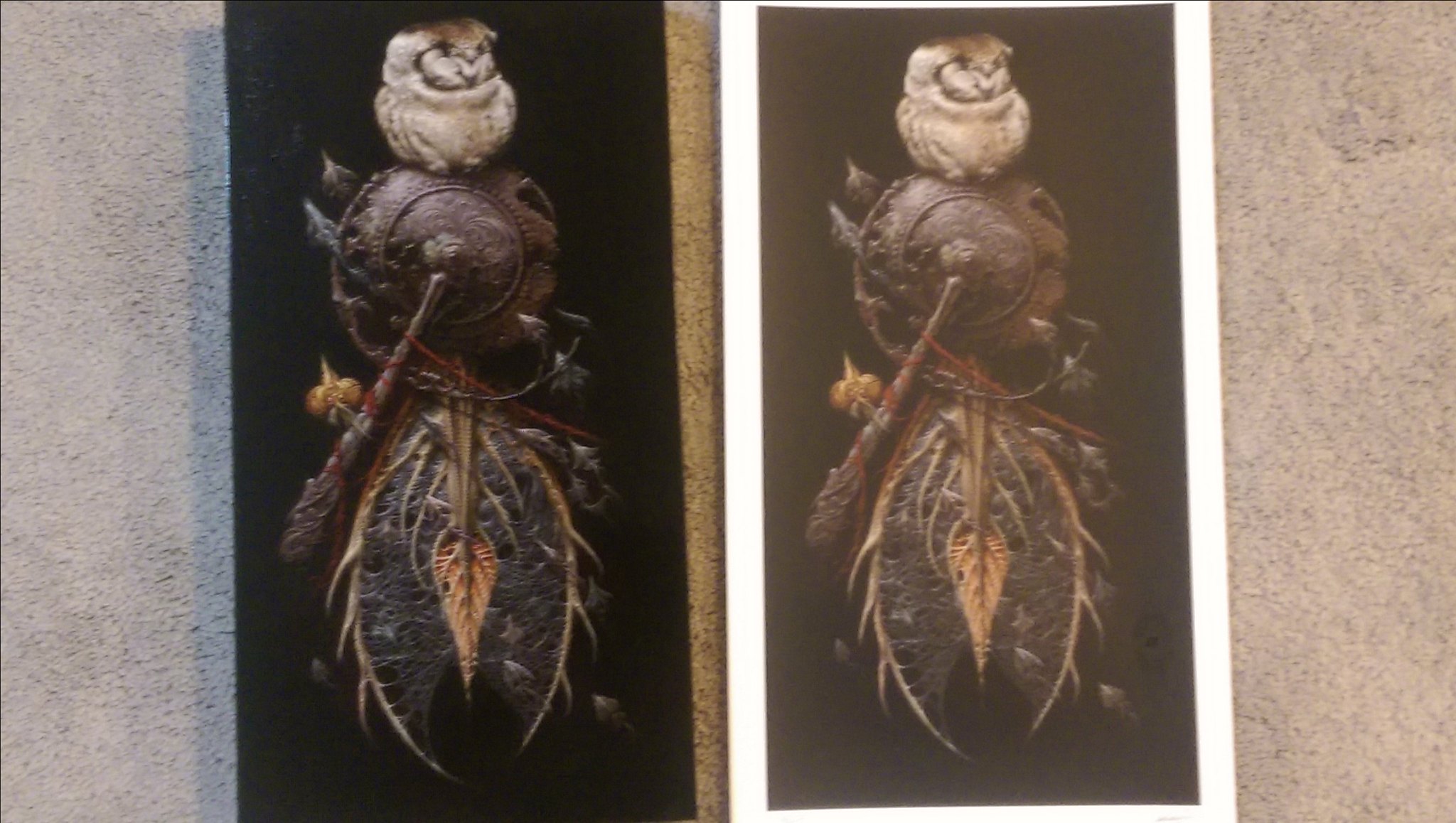
New topics are added by clicking the "Add Comment" link on an art entry. Off-topic posts may be purged.
Forum rules
• Posts in this forum should directly relate to the artist, art, or artwork.
• Do not post ISOs or FS/Ts in this forum section. Please use the Open Market section of the EB forums for all secondary (resale) market activity.
• Do not post details of your order process, shipping status, or condition upon arrival in this forum section. Please use the item's Release Discussion thread for this activity.
-
Dreadyhead4
- Art Connoisseur
- Posts: 661
- Joined: Sun Mar 19, 2006 2:00 am
- Location: Colorado USDA Zone 5
Tue Sep 06, 2016 7:02 pm
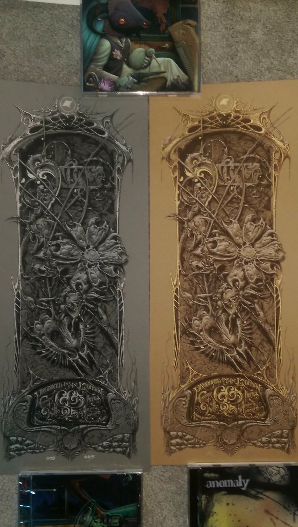
ToolFanFromWayBack wrote:Mine came to day and both are stunning. I got the COA on the left and noticed it has a metallic gold layer. Anyone with the one on the right - does it have a silver metallic layer?
Yes, the grey one has a silver metallic layer.

THC

-
Weaksauce
- Art Connoisseur
- Posts: 417
- Joined: Wed Dec 18, 2013 7:47 pm
Tue Sep 06, 2016 9:00 pm
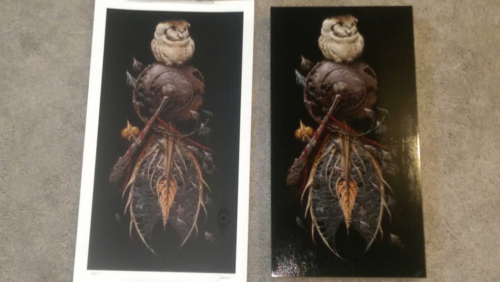
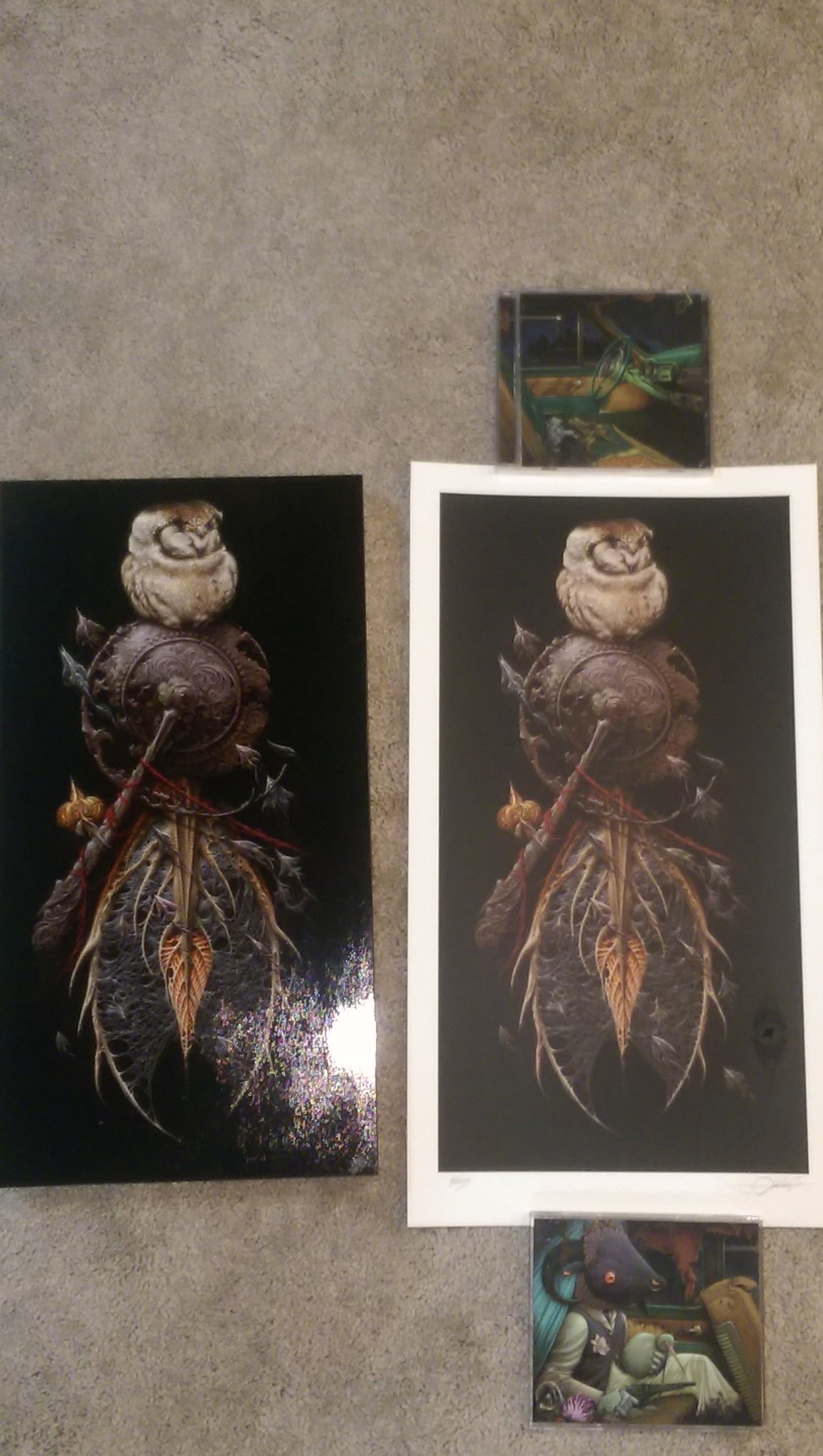
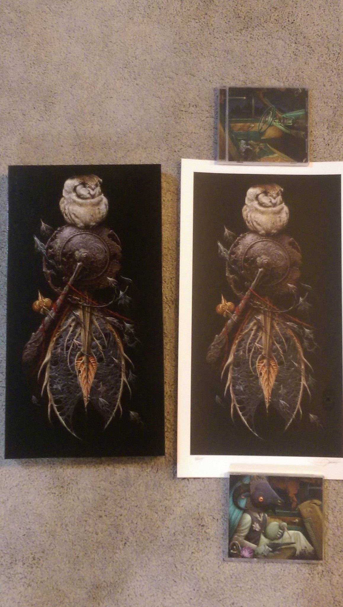
Well damn, I didn't realize you had the OG haha. Do you have the pencil as well? The pencil was my personal favorite, but now that I think about it, maybe that one wasn't for sale.
Thanks for the comparison, the OG vs print was a nice touch.
-
Baker
- Art Expert
- Posts: 6171
- Joined: Tue Sep 28, 2010 12:06 pm
- Location: Nashville, TN
Tue Sep 06, 2016 9:40 pm
Weaksauce wrote:Well damn, I didn't realize you had the OG haha. Do you have the pencil as well? The pencil was my personal favorite, but now that I think about it, maybe that one wasn't for sale.
Thanks for the comparison, the OG vs print was a nice touch.
The study was NFS
ironjaiden wrote: "'Weener in June' is completely sold out, thanks for the interest"

-
35mmpaul
- Art Expert
- Posts: 8923
- Joined: Sat Oct 13, 2012 10:40 pm
- Location: NYC
Tue Sep 06, 2016 9:45 pm
Would love to see more pics if you have a camera as dope as those OGs.
jkw3000 - Nobody ever really wins in this hobby.
Olly - I'm a hack asshole unable to provide you with what you want.
Gonzo's Mom- And some of you are the demons!
-
ceevee
- Art Expert
- Posts: 7592
- Joined: Wed Sep 02, 2009 6:06 pm
Tue Sep 06, 2016 9:49 pm
Beautiful. Thanks for the pics, greenhorn.
I believe that the pencil was claimed before the preview went out. I have an idea of where that one is, but not certain.
-
sidewaysscott
- Art God
- Posts: 23734
- Joined: Thu May 15, 2008 11:22 am
- Location: denver
Wed Sep 07, 2016 9:17 am
seeing the og vs print is nice. When i opened up the print, i thought the colors seemed muted. I really think that in comparison to the OG. I wish the colors were a little brighter. Still nice nonetheless.
pay via paypal, use credit card,file dispute at the 20 day mark if suspicious. don't deal with noobs. don't trade with noobs. request feedback ahead of time. there are lots of good people 'round here.
-
talkingdeads
- Art Expert
- Posts: 7276
- Joined: Wed Jul 09, 2008 6:54 pm
- Location: it's subjective
Wed Sep 07, 2016 9:46 am
Very nice, Aaron! Now, i wish the the black was blacker...but i always do anyway haha!
-
jmagee87
- Art Expert
- Posts: 6029
- Joined: Wed Apr 17, 2013 12:02 pm
- Location: Baton Rouge, LA
Wed Sep 07, 2016 10:58 am
talkingdeads wrote:Very nice, Aaron! Now, i wish the the black was blacker...but i always do anyway haha!
Kramerica wrote:never listen to anything rambo says.
RambosRemodeler wrote:You're entitled to your opinion but it's wrong.
-
simianfever
- Art Expert
- Posts: 2225
- Joined: Mon Jan 30, 2012 9:50 am
- Location: CT
Wed Sep 07, 2016 3:42 pm
alittle wrote:The original really makes the print look washed out.
From certain angles the print does get washed out. Not sure if a result of the varnish or what. My only complaint with the package.
-
mfaith
- EB Team Emeritus
- Posts: 52227
- Joined: Fri Jun 06, 2014 4:50 pm
- Location: Austin, TX
Wed Sep 07, 2016 4:16 pm
Isn't the varnish just where the osprey logo is? Varnish gives that glossy sheen usually. The OG had a layer of varnish on top of it.
So it goes...
-
jmagee87
- Art Expert
- Posts: 6029
- Joined: Wed Apr 17, 2013 12:02 pm
- Location: Baton Rouge, LA
Wed Sep 07, 2016 4:19 pm
mfaith wrote:Isn't the varnish just where the osprey logo is? Varnish gives that glossy sheen usually. The OG had a layer of varnish on top of it.
I think so. I think a varnish over the whole thing may have actually been a good idea to give it that same gloss the OG has (this could be a terrible idea, I have no idea). Was a little disappointed with how washed out the image is in person
Kramerica wrote:never listen to anything rambo says.
RambosRemodeler wrote:You're entitled to your opinion but it's wrong.

 THC
THC