
35mmpaul wrote:Or got too busy making Eric Clapton posters to finish this commission.
That couldn't be it. The Eric Clapton poster is just a rehash of a magazine image from years ago.
Art discussion forum.
35mmpaul wrote:Or got too busy making Eric Clapton posters to finish this commission.
Time is but a construct for the elites.Kramerica wrote:35mmpaul wrote:Or got too busy making Eric Clapton posters to finish this commission.
That couldn't be it. The Eric Clapton poster is just a rehash of a magazine image from years ago.
I just don't see it. And perhaps it is because I was on the commission and saw the progress and revisions and various layouts he did. He had 3 or 4 concepts, refined, tweaked. We looked at colors but thought it was better with one. I understand not liking it, but this was well thought out and a lot of time went into it. And I understand everyone is entitled to an opinion, and I have no problem with not liking it. I just can't comprehend how someone looks at this and thinks that no work went into it.soam24 wrote:RambosRemodeler wrote:jrsheppa wrote:No its not. I have been so excited to gt this one. Likenesses are a little stylized. Layout is amazing. If you really think this is bad, you are too Mondo-jaded.soam24 wrote:I'm sorry, but this is bad.
Mondo jaded? Not really. The illustrations aren't great. If the art is good, it's good. No one gives a fudge who puts it out. That's a drymounting stupid statement.
JR it's bad IMO. It looks incomplete to me.. Almost like the artists sketchbook slopped together that couldn't come to a complete design.
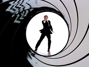 with poorly drawn images randomly placed around the barrel hole..

35mmpaul wrote:Look if the commission is happy with it than that is groovy.
But its just looks unfinished.
I just don't see how color wouldn't have worked here.
The whole film is a beautiful swatch of blues battling fire oranges.
If you make the whole poster grey like this it looks like a refined sketch for the poster waiting to be colored.

choke wrote:I won't give up a flip that I can get myself to someone who is convinced they need it. None of us need any of this fudge. It's art. It's not medicine.

But they want confirmation that their poster is cool and that people will buy it35mmpaul wrote:Look if the commission is happy with it than that is groovy.
ISO: "Champagne Charlie" sheet music cover by Alfred Concanenrecycler wrote:You do not need poster nerds to tell you what you should like.
That's not it. Maybe for some people it is. But this was the other print I was really excited about getting other than Nico's Inception. And I would love it if people liked it, but I don't want them to like it cause I want to flip it. I love the print and I'm going to keep it. I'm sure others will sell. I just don't understand the comments that look at a final project and infer that clearly no work was put in in the production. We all took a hand in helping the print get done and I think people in the group are happy.mrsippycups wrote:But they want confirmation that their poster is cool and that people will buy it35mmpaul wrote:Look if the commission is happy with it than that is groovy.
If the paper isn't worth anything than how is it art?!?

 #trollcru
danieldanger wrote:what you do aint hustlin. see, in MY hustle, i get to sell the whole run and each print only costs me like $6. y'alls is small potatoe street level fudge.

As you wish.35mmpaul wrote:Can we see the coloring examples that were passed on?


