General art-related discussion.
-
misterx
- Art Expert
- Posts: 7220
- Joined: Thu Dec 24, 2009 1:35 am
- Location: Yeppoon
Wed Aug 22, 2012 8:29 pm
treweman wrote:Just got confirmation that the deed is done. I am a fan of the older Hush, anime art, and managed to strike a deal for the 2008 Fantasie's for Naughty Boys II OG...

which will look smashing with the 2008 Faile piece Sinful Pleasures in Blue (#01/02) ...

It's been a very good week for me ... and trust me when I write that I needed one.
Couldnt agree more regarding Hush's earlier anime -style pieces....much prefer them to his latest direction.
Congrats treweman..bet the OG cost you a bit? Gallery purchase or private?
Even the anime prints are quite costly, so an OG even more so....i'm jealous.
War is peace. Freedom is slavery. Ignorance is strength.
-
roo
- Art Expert
- Posts: 4354
- Joined: Tue Jun 17, 2008 3:45 pm
- Location: Sydneysiding
Wed Aug 22, 2012 8:55 pm
misterx wrote:treweman wrote:Just got confirmation that the deed is done. I am a fan of the older Hush, anime art, and managed to strike a deal for the 2008 Fantasie's for Naughty Boys II OG...
which will look smashing with the 2008 Faile piece Sinful Pleasures in Blue (#01/02) ...
It's been a very good week for me ... and trust me when I write that I needed one.
Couldnt agree more regarding Hush's earlier anime -style pieces....much prefer them to his latest direction.
Congrats treweman..bet the OG cost you a bit? Gallery purchase or private?
Even the anime prints are quite costly, so an OG even more so....i'm jealous.
Not very often i am envious but with those 2 i would have to say.......


-
halftonegraphics
- Art Freak
- Posts: 15372
- Joined: Wed Oct 20, 2010 7:10 pm
Wed Aug 22, 2012 8:56 pm
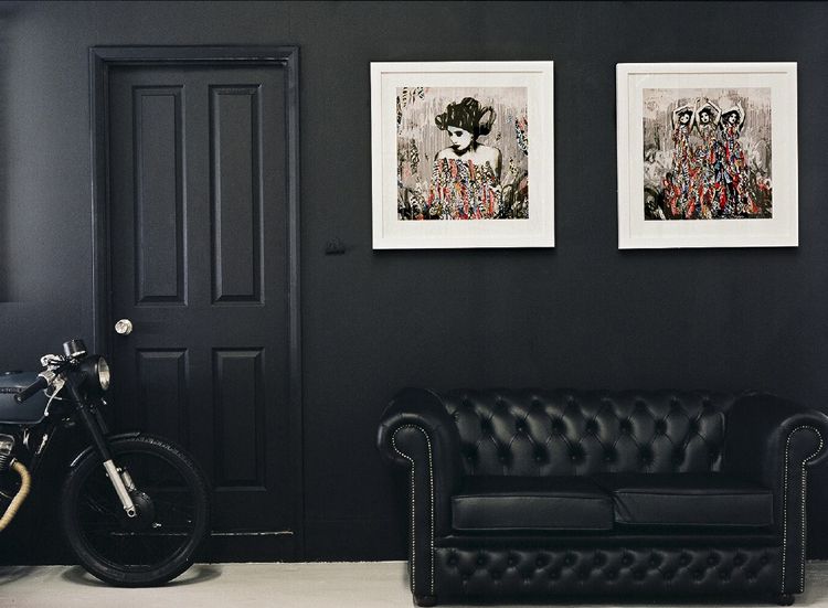
Finally got my frames in. Unfortunately, need to wait for the replacement prints now.
Did a quick throw together. Thinking a light blue mat underneath (lighter than the one shown, this is all I had on hand).
Part of me is saying go with a bright red though. We shall see.
P1140671.JPG
Should end up similar to this..
550998_10101562618202491_458708368_n.jpg
I broke something today, and I realized I should break something once a week.. - Warhol
1xRun Referral
-
treweman
- Art Expert
- Posts: 7123
- Joined: Sat Dec 25, 2010 5:53 pm
- Location: upstate new york
Thu Aug 23, 2012 12:41 am
halftonegraphics wrote:Finally got my frames in. Unfortunately, need to wait for the replacement prints now.
Did a quick throw together. Thinking a light blue mat underneath (lighter than the one shown, this is all I had on hand).
Part of me is saying go with a bright red though. We shall see.
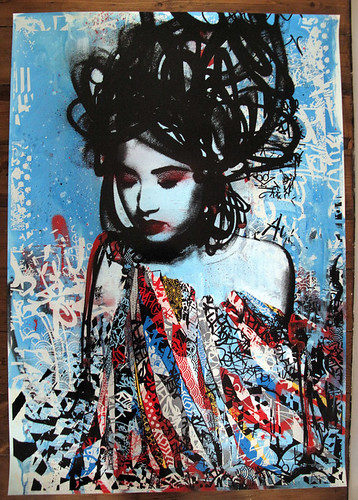
I am not a fan of mats that draw the eye away from an image. With as much color and complexity as there is in the Three Sirens piece, I think any brightly colored mat (thinking the suggested red) would be a mistake. My general rule of thumb is plain and simple with complex and large images, and more creativity with simpler and/or smaller pieces. Just my 2 cents.
-
shibby
- Art Expert
- Posts: 1160
- Joined: Thu May 21, 2009 6:43 pm
- Location: Los Angeles, CA
Thu Aug 23, 2012 1:04 am
halftonegraphics wrote:Finally got my frames in. Unfortunately, need to wait for the replacement prints now.
Did a quick throw together. Thinking a light blue mat underneath (lighter than the one shown, this is all I had on hand).
Part of me is saying go with a bright red though. We shall see.
P1140671.JPG
Should end up similar to this..
550998_10101562618202491_458708368_n.jpg
how bad is the damage in this print?
-
halftonegraphics
- Art Freak
- Posts: 15372
- Joined: Wed Oct 20, 2010 7:10 pm
Thu Aug 23, 2012 1:26 am
treweman wrote:halftonegraphics wrote:Finally got my frames in. Unfortunately, need to wait for the replacement prints now.
Did a quick throw together. Thinking a light blue mat underneath (lighter than the one shown, this is all I had on hand).
Part of me is saying go with a bright red though. We shall see.
I am not a fan of mats that draw the eye away from an image. With as much color and complexity as there is in the Three Sirens piece, I think any brightly colored mat (thinking the suggested red) would be a mistake. My general rule of thumb is plain and simple with complex and large images, and more creativity with simpler and/or smaller pieces. Just my 2 cents.
Yeah. And I think that's why I logically want to go with a lighter blue. A more calming choice.
Last edited by
halftonegraphics on Thu Aug 23, 2012 1:29 am, edited 1 time in total.
I broke something today, and I realized I should break something once a week.. - Warhol
1xRun Referral
-
halftonegraphics
- Art Freak
- Posts: 15372
- Joined: Wed Oct 20, 2010 7:10 pm
Thu Aug 23, 2012 1:28 am
shibby wrote:halftonegraphics wrote:Finally got my frames in. Unfortunately, need to wait for the replacement prints now.
Did a quick throw together. Thinking a light blue mat underneath (lighter than the one shown, this is all I had on hand).
Part of me is saying go with a bright red though. We shall see.
P1140671.JPG
Should end up similar to this..
550998_10101562618202491_458708368_n.jpg
how bad is the damage in this print?
Both of mine have corner damage / soft corners. One has some light edge ruffles. One has a creased corner. Minor in the scheme of things, but also unacceptable. Being I want to float them, not much of an option but to have them replaced.
I broke something today, and I realized I should break something once a week.. - Warhol
1xRun Referral
-
earlgreytoast
- Art Expert
- Posts: 9368
- Joined: Fri Nov 05, 2010 1:14 pm
Thu Aug 23, 2012 2:04 am
I think that light blue really mutes the vibrant colors of the print. I don't know if a bright red is the solution but I bet it would look 100% better than that blue. Maybe a rich royal blue similar to some of the blues in the print? Fun to think about...
Codeblue wrote:
I’m sorry for everything.
-
halftonegraphics
- Art Freak
- Posts: 15372
- Joined: Wed Oct 20, 2010 7:10 pm
Thu Aug 23, 2012 8:16 am
earlgreytoast wrote:I think that light blue really mutes the vibrant colors of the print. I don't know if a bright red is the solution but I bet it would look 100% better than that blue. Maybe a rich royal blue similar to some of the blues in the print? Fun to think about...
For sure. I want to use a lighter but more saturated blue. Intending to match the light blue in the print.
I broke something today, and I realized I should break something once a week.. - Warhol
1xRun Referral
-
dtrain
- Art Connoisseur
- Posts: 299
- Joined: Mon May 28, 2012 10:57 am
Thu Aug 23, 2012 10:08 am
^ I like that a lot, but think I'd have gone with a black background to contrast the white frame.
Moments in Soul II
Edition: 3 (each one unique)
Not numbered but - Each one will be inscribed verso 'Moments in Soul from an edition of 3)
Hand Painted Multiple with acrylic paint, screenprint & spraypaint.
350gsm Somerset Paper.
Size: 42"x28"
-
someonesbrain
- Art Enthusiast
- Posts: 96
- Joined: Thu Jul 31, 2003 12:00 am
- Location: Germany
Thu Aug 23, 2012 5:05 pm
halftonegraphics wrote:Finally got my frames in. Unfortunately, need to wait for the replacement prints now.
Did a quick throw together. Thinking a light blue mat underneath (lighter than the one shown, this is all I had on hand).
Part of me is saying go with a bright red though. We shall see.
I took your pic and did some quick photoshop work. Just changed the color of the matte so we can get an impression. Here's some examples what it could look like (very light blue, grey, brown):
-
someonesbrain
- Art Enthusiast
- Posts: 96
- Joined: Thu Jul 31, 2003 12:00 am
- Location: Germany
Thu Aug 23, 2012 5:09 pm
Here are another three examples (yellow, white and a dark red). I'm not completly satisfied with the results. In the moment I'm considering to frame my single siren with a black matte and some kind of silver (?) or even golden (?) frame. Not sure though ... decisions to be made ...

-
treweman
- Art Expert
- Posts: 7123
- Joined: Sat Dec 25, 2010 5:53 pm
- Location: upstate new york
-
shibby
- Art Expert
- Posts: 1160
- Joined: Thu May 21, 2009 6:43 pm
- Location: Los Angeles, CA
Thu Aug 23, 2012 6:54 pm
halftonegraphics wrote:shibby wrote:halftonegraphics wrote:Finally got my frames in. Unfortunately, need to wait for the replacement prints now.
Did a quick throw together. Thinking a light blue mat underneath (lighter than the one shown, this is all I had on hand).
Part of me is saying go with a bright red though. We shall see.
P1140671.JPG
Should end up similar to this..
550998_10101562618202491_458708368_n.jpg
how bad is the damage in this print?
Both of mine have corner damage / soft corners. One has some light edge ruffles. One has a creased corner. Minor in the scheme of things, but also unacceptable. Being I want to float them, not much of an option but to have them replaced.
totally makes sense. I wonder how long it'll take for them to reprint and replace though. such a nice print.