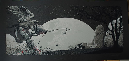
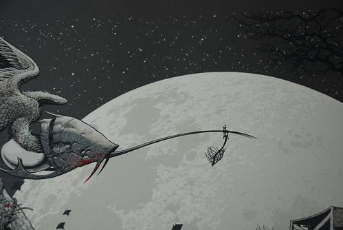
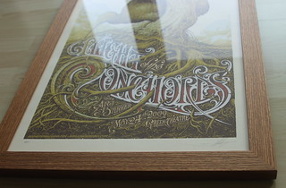
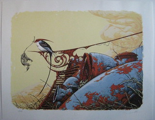
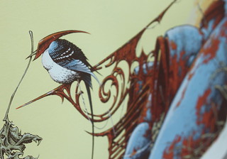
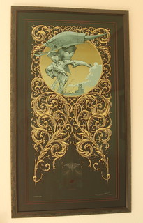
As we all know, Aaron has done well over 250 individual print editions by now, with some images seeing only one single edition and some others going into as much as 19 different printing/color/paper variations. Taken all of that into account: Which 10 prints are your personal favorites?
Now, this thread is just for fun, so I don't want to get to far out on rules and stuff, but, just to make it comparable: Please choose 10 individual prints and put them in a numbered line. Runner ups are cool, but list them separate from your TOP10. If you want to include 2 versions of the OTA or WBG in that list, go ahead! If you want to include a print you never even seen in the flesh, do what you have to. Personally, I've done a TOP25 and kept re-arranging until I had the 10 that, for me, stood out above all the others. And, believe me, it WAS hard! And I did try to stick to prints I had seen with my own eyes, well, except for one single print - and that one actually made #1...
So, just to make it clear and keep it comparable: Choose 10 prints designed by Aaron Horkey (alone! no colabs!), printed on paper (screenprint, giclee or letterpress) bearing an edition number (nothing that's been painted or remarqued outside of the edition) and put them in an order from 1 to 10. Humor us.
Thanks for playing