
Detritus was hand-finished. The numbering and the blue were applied by hand. Plus, it was printed with some super special old gold dust from Ben's grandfather.appletree wrote:The wink is throwing me off (I am a little slow on Mondays, ok maybe most days).
Really you think it will be less than 100? Wasn't the regular detritus like $250, I would think this is similar unless Detritus was hand finished (I thought only the Japan was though) Thanks for any enlightenment to the matter I am still a little green on Horkey matters.
Thanks again.
Midwestern Heart 10 Horkey
Forum rules
• Posts in this forum should directly relate to the artist, art, or artwork.
• Do not post ISOs or FS/Ts in this forum section. Please use the Open Market section of the EB forums for all secondary (resale) market activity.
• Do not post details of your order process, shipping status, or condition upon arrival in this forum section. Please use the item's Release Discussion thread for this activity.

I have been a fan of Aaron's artwork for several years now, and this is one of my favorite of his compositions, preceded only by "Nesting". I may have to go back and look at his work over the years to confirm that claim, but it seems to me to be an accurate comment. What makes "Nesting" so attractive in my opinion is the lack of fantasy in the imagery. Yes, the bird has a little helmet, but it's so subtle that it almost seems like a natural extension of the bird. Actually, when recalling the print from memory; I don't even see the helmet.
Aaron is an incredible talent and he has his own unique style and predispositions to the imagery that he employs, but what I am personally most drawn to is the realism of his work, not the fantasy. I would love to see this image minus the helmet on the crow, and perhaps without the smoke. I realize that they are somewhat trademarks of Aaron's particular style, but in my opinion they actually detract from the image. I am patiently waiting for the day that Aaron decides to dispense with the fantasy elements of his work, and focus on producing completely realistic rural images. I want to hang something on my wall that I can relate to, and I just can't get my head around those crazy helmeted birds.
In closing; I love this print, and I will be trying my darnedest to get my hands on one. If Aaron never chooses to lose the fantasy elements of his artwork, I'll still always love what he does. The realism and level of detail of his artwork is second to none! This is merely my personal opinion on how one might go about perfecting on perfection
"Selling my stories to the violent and perverted, all eyes are on me and I don't deserve it
Nothing to do, except I guess to play blues, sleep in my car, I’m yesterdays news"
~ Richard Terfry aka Buck 65
http://www.myspace.com/bikeforthree
Nothing to do, except I guess to play blues, sleep in my car, I’m yesterdays news"
~ Richard Terfry aka Buck 65
http://www.myspace.com/bikeforthree
-
ironjaiden

- Art Expert
- Posts: 7980
- Joined: Thu Jul 10, 2008 6:57 pm
- Location: Hollarado
- Contact:

-
rhythmgtr5

- Art Expert
- Posts: 1347
- Joined: Fri Jan 15, 2010 4:38 pm
I just noticed the stingrays in the clouds - very cool. Looking forward to the road trip to Windom


So I noticed that the Letterpress series started with the Scavenger as the number 2 print of the series and the number one print was not disclosed as to what it would be. Does anyone else think this will be it?
Artoholic... Why attempt to dissect the work of a genius ? What you are hoping for is another artist.artoholic wrote: I am patiently waiting for the day that Aaron decides to dispense with the fantasy elements of his work, and focus on producing completely realistic rural images.:
This piece is balanced in every way. Removing or altering one or any elements would destroy its chaotic harmony and compromise the vision itself.
That is the gift of the artist not the viewer. It is pure lyrical majesty as is.
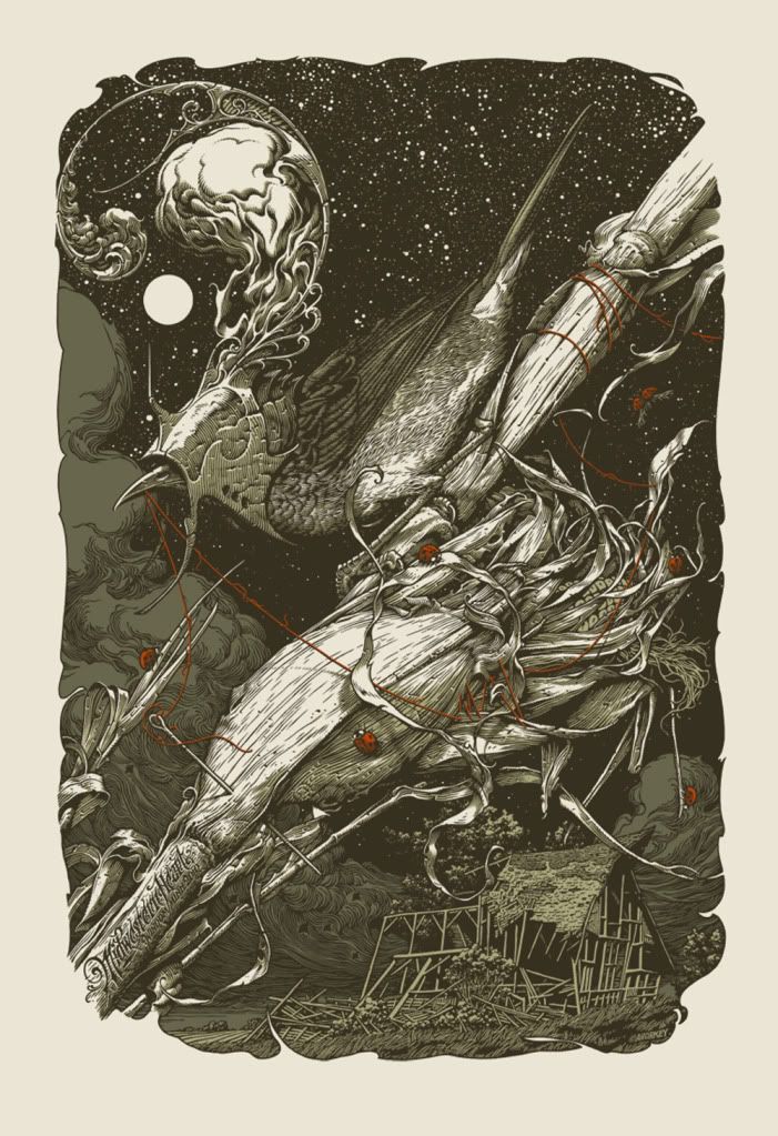


I love the helmet and the sky on this one.
I wonder if his bird reference was from his visit to (wherever they went) with Jay Ryan a few months ago. It was stated by Jay that Aaron went off to the bird exhibit.
I wonder if his bird reference was from his visit to (wherever they went) with Jay Ryan a few months ago. It was stated by Jay that Aaron went off to the bird exhibit.
 = T.H.C.
-
ChefFerrari

- Art Expert
- Posts: 8335
- Joined: Mon Oct 06, 2003 12:00 am
I wish I could speak as eloquently as Downtown
http://www.ic3.govInternet Fraud Complaint
Never Forget, June 26 2008 ryan_1969
Inside the Poster
INSIDE THE ROCK POSTER FRAME * More than just Rock Posters, Posters that Rock
Never Forget, June 26 2008 ryan_1969
Inside the Poster
INSIDE THE ROCK POSTER FRAME * More than just Rock Posters, Posters that Rock
-
TheThirdEye

- Art Expert
- Posts: 4486
- Joined: Fri Apr 17, 2009 12:07 am
- Location: Northern California
I think the "fantasy elements" in Aaron's work is what attracted me to his art in the first place. Well, second only to the execution and skill of his illustration. The helmeted birds, unexplained wounds, threads of string, flying rays, and animals that would make a Cryptozoologist piss their pants, they all fascinate me. The fact that they are repeated throughout his art makes them iconic. Throw in some rural dilapidated farm houses and/or some decaying vegetation, and you have a masterpiece. While I don't always know what these fantasy elements symbolize, they leave me with a sense of wonder and intrigue. Like there is a story behind the imagery that I'll never understand, and I never really want to. The true meaning is probably less interesting than what my mind creates in the absence of explanation. Top all of this off with the best typography and filigree skills that I have ever seen. I wouldn't want anything different out of Aaron.

-
mistersmith

- Art Freak
- Posts: 13562
- Joined: Sat Nov 17, 2007 5:09 am
- Location: SF, CA
I love this and really, really want one...but I think putting it up with his classics is premature. Just because we're excited doesn't mean it's the best ever.
In my opinion, the greats -- Nesting, Mogwai, WBG, probably Genghis Tron, I personally love Aepyornis -- all have one thing in common that this one lacks: breathing room. Negative space. This one has a cluttered, dense image and it took me a minute to dissect what's going on. I squinted to take this one in, usually with Horkey my eyes get bigger to take in the whole scene. I don't think an image of his has been taken me this long to absorb since I first unrolled the Black Grist stuff (and the one-color printing on those has a lot to do with making them difficult to assess). It feels like too much art in not enough bag.
Despite his own claims to the contrary I am of the opinion that Horkey is the best "drawer" alive. It's not really fair to call him an illustrator, I think, since it seems to detract from his lettering abilities. And this is a fine representation of his talents. Not judging the print, since I haven't seen it, though I'm willing to bet it's perfect, but purely on the illustration I think this is goddamn amazing, but not up there with the best of the best.
Though I bet as far as original inks go, this one is probably the most mindbending. I'd probably get lost in that one, in all the right ways. Seriously, I can't even fathom someone drawing that pen-to-paper. Just making that starry sky in the negative kicks my ass.
Take this man at his word:electrachrome, mostly kidding wrote:mr smith, EB's poet laureate.
misterx wrote:Don't enter into discourse with me.
-
greenhorn1

- Art Expert
- Posts: 8790
- Joined: Tue Jun 06, 2006 12:00 am
Assuming you're talking about scavenger being Dead Arts 002, DA001 was the dead man print.RITFW wrote:So I noticed that the Letterpress series started with the Scavenger as the number 2 print of the series and the number one print was not disclosed as to what it would be. Does anyone else think this will be it?
ISO Horkey Stacy Lowery Paleo Deck. $$$$$$$ (or trade)
-
electrachrome

- Site Admin
- Posts: 18199
- Joined: Tue Jun 22, 2004 12:00 am
- Location: Boston
I like all the busy. I just hope it has a bit more contrast (deep black) and isn't as flat as this image translates.mistersmith wrote:I love this and really, really want one...but I think putting it up with his classics is premature. Just because we're excited doesn't mean it's the best ever.
In my opinion, the greats -- Nesting, Mogwai, WBG, probably Genghis Tron, I personally love Aepyornis -- all have one thing in common that this one lacks: breathing room. Negative space. This one has a cluttered, dense image and it took me a minute to dissect what's going on. I squinted to take this one in, usually with Horkey my eyes get bigger to take in the whole scene. I don't think an image of his has been taken me this long to absorb since I first unrolled the Black Grist stuff (and the one-color printing on those has a lot to do with making them difficult to assess). It feels like too much art in not enough bag.

i usually like the open space too, but i do sometimes like busy. this one happens to be busy and i'm cool with that. just means more time spent taking it all in and dissecting it.
at first i did think this was extremely busy but the more i look at it, which has been a lot over the last 24 hours, the less busy it seems. or at least i can see far more clear distinctions between the different parts of the scene (in terms of distance) - the cornstalk and bird, then the house, the clouds, and finally, the starry sky. and of course the red is a nice touch.
the only one of Aaron's signature elements that seems to be missing is a creature bleeding. though maybe the string came from a pool of another creature's blood. who the hell knows in that crazy Horkey universe?
and you gotta remember this is a night scene and therefore you wouldn't expect there to be too much brightness, except for what's right up close. sure, WBG has a lot more contrast than this but that was one BIG-ass moon.
edit to add: i really love this poster!