Phish Las Vegas 21 Welker
Forum rules
• Posts in this forum should directly relate to the artist, art, or artwork.
• Do not post ISOs or FS/Ts in this forum section. Please use the Open Market section of the EB forums for all secondary (resale) market activity.
• Do not post details of your order process, shipping status, or condition upon arrival in this forum section. Please use the item's Release Discussion thread for this activity.

-
JeffD27177

- Art Enthusiast
- Posts: 20
- Joined: Sat Feb 21, 2009 4:14 pm
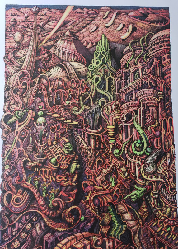
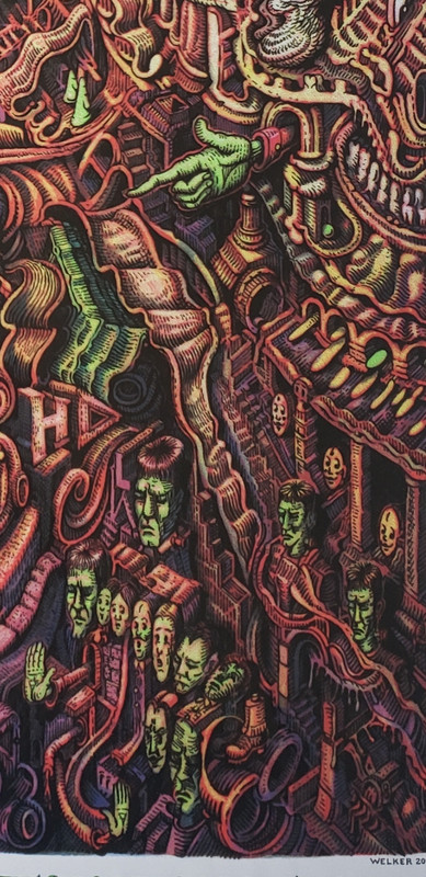
Artwork is phenomenal but I have to say I’m a little disappointed in the print quality. Sort of feels more like a digital reproduction than a screen print. Just a little flat and washed out, and almost pixelated.
Appreciate the effort on the artwork though. Welker’s work is always impressive.
Appreciate the effort on the artwork though. Welker’s work is always impressive.
Collecting Phish and Pollock posters
-
ajharrington321

- Art Expert
- Posts: 1240
- Joined: Sun Oct 04, 2009 4:09 pm
- Location: Denver, Colorado
"I’ll say it again… This is the most exquisite screen print work I’ve ever seen. Has to been seen in person to be fully understood. Thank you"


-
Sterlingpiper83
- Art Connoisseur
- Posts: 103
- Joined: Wed Apr 07, 2021 1:29 am
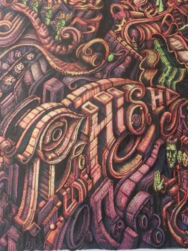
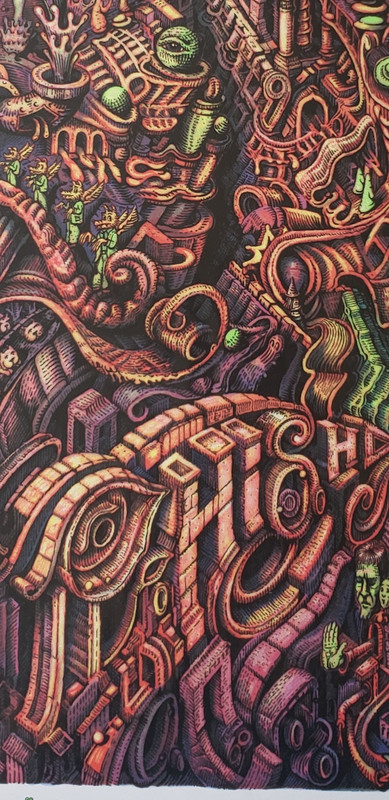
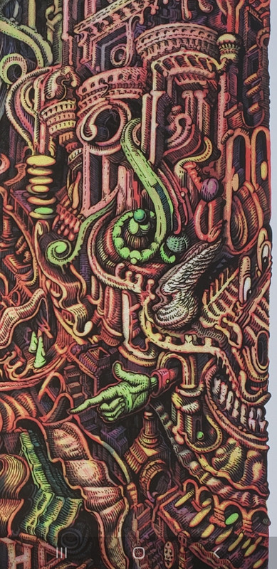
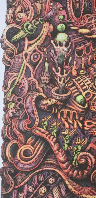
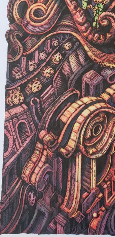
These aren't great, the next time I have a chance to take it out of the sleeve I will take better close ups of the detail for You bubbie 
-
Grateful69Phish

- Art Freak
- Posts: 12771
- Joined: Tue Nov 13, 2007 7:41 pm
- Location: Nirvana
thanks for taking the time.....
still believe it's the color tone choices that draw the washed out comment
print had GID potential
still believe it's the color tone choices that draw the washed out comment
print had GID potential
-
Sterlingpiper83
- Art Connoisseur
- Posts: 103
- Joined: Wed Apr 07, 2021 1:29 am
GID? Glow In Dark? That would be amazing!
Grateful69Phish I, at first, thought it was a bit of a blah colorway, after having spent some time staring at the detail, I get it. I live in Vegas, the color choices are very fitting for the desert, it doesn't pop like the neon lights of the Strip, but the beauty is real, the love is there, the symbolism he has injected into this print is just fantastic, these colors work on many levels, in my worthless to all but me opinion
Grateful69Phish I, at first, thought it was a bit of a blah colorway, after having spent some time staring at the detail, I get it. I live in Vegas, the color choices are very fitting for the desert, it doesn't pop like the neon lights of the Strip, but the beauty is real, the love is there, the symbolism he has injected into this print is just fantastic, these colors work on many levels, in my worthless to all but me opinion
-
Grateful69Phish
- Art Freak
- Posts: 12771
- Joined: Tue Nov 13, 2007 7:41 pm
- Location: Nirvana
excellent insight on the color choices - that had not occurred to me! YOU GET ITSterlingpiper83 wrote: ↑Thu Dec 09, 2021 12:20 pmGID? Glow In Dark? That would be amazing!
Grateful69Phish I, at first, thought it was a bit of a blah colorway, after having spent some time staring at the detail, I get it. I live in Vegas, the color choices are very fitting for the desert, it doesn't pop like the neon lights of the Strip, but the beauty is real, the love is there, the symbolism he has injected into this print is just fantastic, these colors work on many levels, in my worthless to all but me opinion
it's that green color that quirked my GID comment, kind of seemed in the ballpark and probably a little wishful dreaming by me.
be well