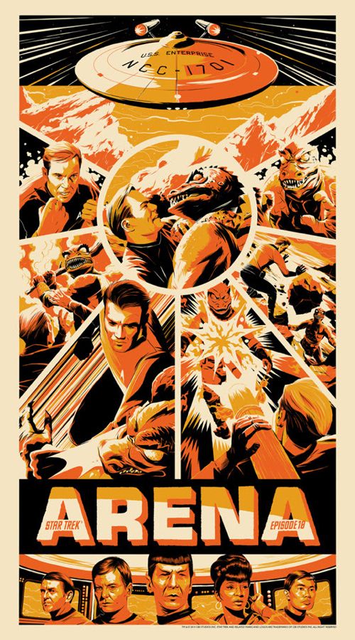
Star Trek: Arena 14 Taylor
Forum rules
• Posts in this forum should directly relate to the artist, art, or artwork.
• Do not post ISOs or FS/Ts in this forum section. Please use the Open Market section of the EB forums for all secondary (resale) market activity.
• Do not post details of your order process, shipping status, or condition upon arrival in this forum section. Please use the item's Release Discussion thread for this activity.
-
rubberneck

- Art God
- Posts: 26101
- Joined: Wed Apr 21, 2010 11:19 pm
- Location: Houston, TX
Lots of energy in the composition, very nice work...
-
xangelx

- Art Expert
- Posts: 2473
- Joined: Thu Sep 10, 2009 1:42 pm
- Location: Brooklyn, NY - Top of the food chain!
I really like this but I wish it said Star Trek in big letters and Arena in small. Deal-breaker... Womp womp.
"If I could fly high above the world, would I see a bunch of living dots spell the word stupidity" - Bad Religion
-
whiterabbit40
- Art Connoisseur
- Posts: 159
- Joined: Sat Dec 31, 2011 6:07 pm
Yeah, really like the artwork but you're absolutely right. One of my favorite episodes when I was a kid.xangelx wrote:I really like this but I wish it said Star Trek in big letters and Arena in small. Deal-breaker... Womp womp.
-
xangelx
- Art Expert
- Posts: 2473
- Joined: Thu Sep 10, 2009 1:42 pm
- Location: Brooklyn, NY - Top of the food chain!
Right? I keep looking at this and overall its really great. One of my favorite episodes, the likenesses are on point, you even have the Enterprise in there, it's probably the best Star Trek print since Olly's Tribbles....but why does it have the episode title in huge letters, it should definitely be Star Trek as the title focus. I mean hes got the episode # in small letters, shouldn't the title be matched to that.....sigh.
"If I could fly high above the world, would I see a bunch of living dots spell the word stupidity" - Bad Religion
-
Lockersocks

- Art Connoisseur
- Posts: 452
- Joined: Sat Jan 04, 2014 7:10 pm
- Location: OH-IO
I'm completely cool with the large Arena text....This is an iconic episode, probably the most famous of the original ST series. This poster pops, lots of action and I like how the poster matches the gold uniforms...It screams 1960's. I like and dislike the size (20x36) at the same time......45 bucks I'm buying

I don't know about the most famous, it was good episode, I personally enjoy The Doomsday Machine & Mirror Mirror. This piece is nice, but I would agree with others that it should have been Star Trek in Large Letters and the rest - Title and all - as smaller text. Hope it goes well, and people who want it get it.Lockersocks wrote:I'm completely cool with the large Arena text....This is an iconic episode, probably the most famous of the original ST series. This poster pops, lots of action and I like how the poster matches the gold uniforms...It screams 1960's. I like and dislike the size (20x36) at the same time......45 bucks I'm buying

-
Lockersocks
- Art Connoisseur
- Posts: 452
- Joined: Sat Jan 04, 2014 7:10 pm
- Location: OH-IO
DinoSoarr wrote:In my mondo Newsletter, I saw this print is going up for sale tomorrow.
Where else was this released??? It's a great looking print!
I think Mondo's the only one releasing it other than maybe a small AP release. 175 of these it'll go quick and might go up in price seeing that there's so few prints and so many Trek fans.
-
jamesmassey1988

- Art Expert
- Posts: 4458
- Joined: Sun Jul 31, 2011 8:26 pm
- Location: Southsea, UK
TWTTR - @masseyjh
INSTGRM - @jimmassey

INSTGRM - @jimmassey


-
rubberneck
- Art God
- Posts: 26101
- Joined: Wed Apr 21, 2010 11:19 pm
- Location: Houston, TX
Why mention this?
Just gives the impression that another artist needed to step in to get it to the finish line.
Art direction by another 'popular artist' need not be publicized as a selling point, imo.
Just gives the impression that another artist needed to step in to get it to the finish line.
Art direction by another 'popular artist' need not be publicized as a selling point, imo.