John Baizley Thread
-
SunflowerSeeds

- Art Connoisseur
- Posts: 966
- Joined: Thu Dec 29, 2011 11:51 am
- Location: New Jersey
Very nice, thanks for the info. Any word on price or how big the run will be?
-
afrosteeziac

- Art Expert
- Posts: 2746
- Joined: Fri Oct 08, 2010 7:51 am
- Location: Atlanta, GA
I feel like I might be in the same boatmurdock wrote:Gotta admint, skull girl actually makes this a harder decision than I'd like it to be...
-
piratesprayer

- Art Expert
- Posts: 3733
- Joined: Sun Dec 21, 2008 4:36 am
just use a 10 inch mat to cover it all the way around haha.murdock wrote:Gotta admint, skull girl actually makes this a harder decision than I'd like it to be...

talkingdeads wrote:My nipples just did a back flip!

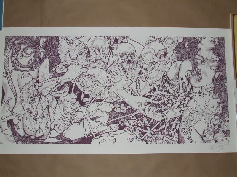
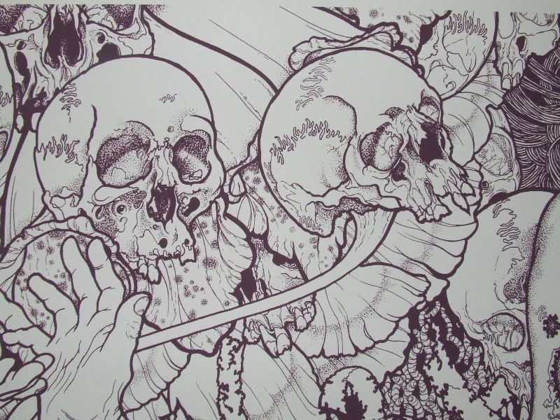
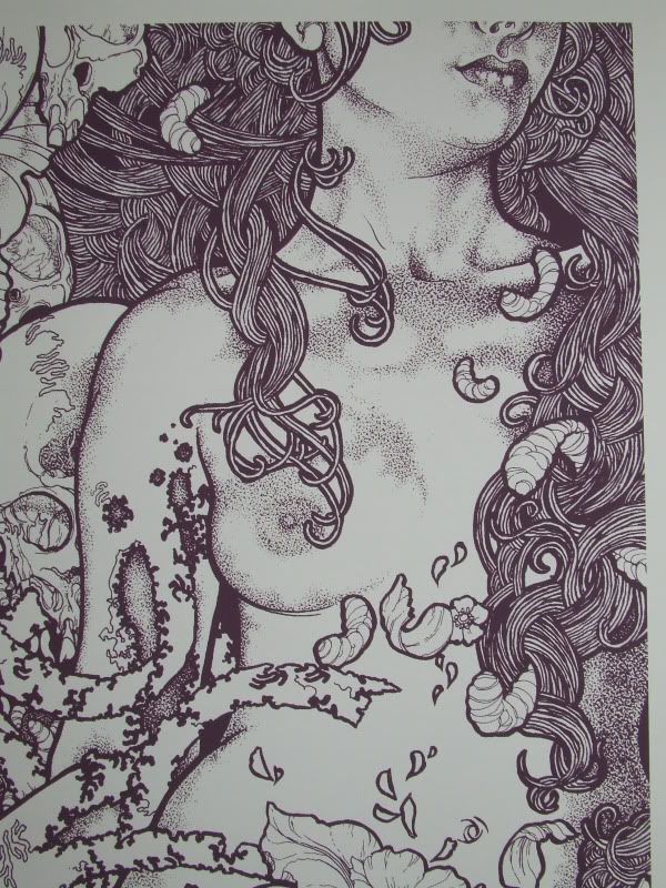
Yeah sadly I love half this image . No arguments over the excution of the left hand side but the proportion of that skull to body (if it's meant as a mask or not) throws me off too much to frame it.
If I had it in front of me I'm sure I'd think differently mind you .
If I had it in front of me I'm sure I'd think differently mind you .


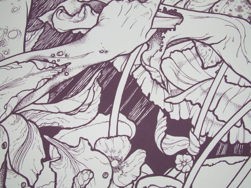
i think that there is often something a little 'off' in his illustrations and that they are meant to be- such as the neck of the woman in 'passage through purgatory':

and her left knee in 'cut them where they bleed':

which makes me think that these 'oddnesses' are supposed to be accepted as off-kilter points of reality departing interest
this is how i come to terms with the 'skull mask' anyway and i shall definitely be attempting to purchase
am also hoping for, but not really expecting, a 'beyond the permafrost' print at some point...
and her left knee in 'cut them where they bleed':
which makes me think that these 'oddnesses' are supposed to be accepted as off-kilter points of reality departing interest
this is how i come to terms with the 'skull mask' anyway and i shall definitely be attempting to purchase
am also hoping for, but not really expecting, a 'beyond the permafrost' print at some point...

Oh, btw, I really like this onepathways wrote: Another new Baroness track:
http://www.spin.com/articles/hear-baron ... llow-green
Not really diggin this one as much as the others
Don’t deal with MillerTime04 - he’s a scammer
-
shivashakti

- Art Connoisseur
- Posts: 919
- Joined: Wed Sep 15, 2010 3:21 pm
this and static tensions would be really phenomenal.qotsa909 wrote:am also hoping for, but not really expecting, a 'beyond the permafrost' print at some point...

I'm probably in the minority on this one, but it doesn't bother me a bit. I heard/read somewhere a long time ago, and I wish I could remember but it said, that when he draws it, that's it. I'm sure he sketches it out and gets an idea for the piece but I don't know how often he actually goes back and erases. I just think it's a part of his process and growth. I'm gonna look for the article later.
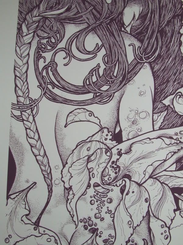
Another example is magpie lady, that left eye is somewhat bigger.

Another example is magpie lady, that left eye is somewhat bigger.


I, too, was hoping for just the right side of the image. I have the Kvelertak t-shirt with the album artwork on the front and it is one of my favorites to wear. Aside from the fact that the band/album is awesome, the artwork is just beautiful. The left side makes the overall piece feel unbalanced. It makes sense for the front and back of a gatefold jacket, but I'm not sure about the print.
Regardless, I still want one.
Regardless, I still want one.
http://thequietus.com/articles/02932-jo ... -metal-art...I’m a staunch disciple of the ‘process’ of making art, it’s a life long thing where you learn more from your missteps and you’re errors than you do from your accolades and perfection. I try to leave room for mistakes and risks to happen, because otherwise, I’m just rendering something. I don’t consider myself adept at rendering, I think it’s a by-product of the reactive or intuitive process...
And also speaks about it here:
http://www.crustcake.com/2008/05/crustc ... izley.htmlYeah, and you also-- if you look through enough of my work you can see that consistently there are technical errors. I tend to favor those errors over something that's a little sleeker looking, so, you know, when a paper grain will show through or when a slight smudge or mistake will happen that's just part of the piece for me. And I welcome-- I embrace that sort of thing that can happen randomly. And I think it lends something different to my work than a lot of other people's.
He goes through some of his pieces too and talks about what they represent.
Interesting stuff I say!