Mark Englert?

-
elSalvador
- Art Connoisseur
- Posts: 134
- Joined: Sun Jun 17, 2012 2:18 am
So, I received my Dewey Cox print today. I knew I liked the image, but I had no idea it would look this good in person. I own over 10 prints from Mark, but I don't think any of them "pop" like this one does in person. The metallics are beautiful. Perfect gig poster.
I'll wait for someone with a decent camera to post pictures.
I'll wait for someone with a decent camera to post pictures.

I saw Pawnee REG in person damn near blinded me how vivid it was.
jkw3000 - Nobody ever really wins in this hobby.
Olly - I'm a hack asshole unable to provide you with what you want.
Gonzo's Mom- And some of you are the demons!
Olly - I'm a hack asshole unable to provide you with what you want.
Gonzo's Mom- And some of you are the demons!
-
markenglert

- Art Expert
- Posts: 3078
- Joined: Fri Nov 20, 2009 7:50 pm
- Location: Lake Arrowhead, CA
- Contact:
It's from pollution caused by the Sweetums factory.35mmpaul wrote:I saw Pawnee REG in person damn near blinded me how vivid it was.

-
cutterbutter

- Art Expert
- Posts: 4714
- Joined: Thu Aug 11, 2011 3:21 pm


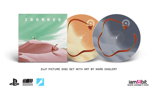


With so many great settings and vistas to visit in this game, I'm puzzled as to why they would go with what's basically a rehash of the Richard print? And with uglier colors? Strange.jrsheppa wrote:Great art, not a huge fan of the color choice. But I am assuming your hands were kind of tied, especially after JC Richard did his.
-
cutterbutter
- Art Expert
- Posts: 4714
- Joined: Thu Aug 11, 2011 3:21 pm
Because its artwork for the soundtrack on vinyl release and the beginning of the game is easily the most identifiable with the game.
The color palette happens in game as well...

The color palette happens in game as well...
I do get your point on the cover artwork. But print-wise, releasing a very similar looking print for the same title seems a missed opportunity and kind of boring, even from a marketing standpoint - would have loved to see something new.cutterbutter wrote:Because its artwork for the soundtrack on vinyl release and the beginning of the game is easily the most identifiable with the game.
The color palette happens in game as well...
And yeah hope I'm wrong but the sand color just looks too dark and saturated, judging from only the preview of course. Looks more like a desert of blood instead of the more pastel pink sunset colors from the gameplay (yes I might play this game too much)
-
planetexpress

- Art Connoisseur
- Posts: 537
- Joined: Tue Oct 26, 2010 1:44 pm
- Location: Boaty McBoatface
Kinda surprised nobody's mentioned this yet but Mark Englert designed two Barbasol cans for the new Jurrasic World movie:
http://www.slashfilm.com/jurassic-world-barbasol/

http://www.slashfilm.com/jurassic-world-barbasol/
Assholes get elected, cause assholes get to vote.