Framed Stuff Part 3

Share your pictures of framed art and discuss framing.
Locked
User avatar
talkingdeads
Art Expert
Posts: 7275
Joined: Wed Jul 09, 2008 6:54 pm
Location: it's subjective

Wed Aug 13, 2008 12:43 am

Image

Diana is truly a sweetheart for painting this scene of my niece for me
Image

Image

This matte is actually the same hue of frond as the girl and swan the colors came out a little wonky on camera
Image

Image

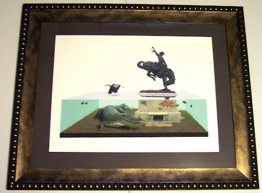
These next few are what poster collecting is all about to me
Image

Image

Image

Image

Image

Image

Image

Image
User avatar
exadore
Art Expert
Posts: 1718
Joined: Thu Jun 05, 2008 10:03 pm

Wed Aug 13, 2008 1:08 am

Impressive collection.
yostarama
Art Connoisseur
Posts: 517
Joined: Mon Oct 02, 2006 1:00 am
Location: Amityville

Wed Aug 13, 2008 1:54 am

I love the Stop sign Talkingdeads. I also have one for over 15 years. it's covered in stickers. In my basement I have all the prints I collected in college. Later Yostarama
sparki
Art Enthusiast
Posts: 29
Joined: Thu May 29, 2003 12:00 am
Contact:

Thu Aug 14, 2008 12:11 pm

here is one I did for a friend....

Tic Toc....

Image


I have a Emek Decemberist, 10,000 Lakes, A Ryden, Fairey and others that I have done this year for friends here ..

http://picasaweb.google.com/aceframing/ ... Frames2008
Burleson65
Art Connoisseur
Posts: 298
Joined: Thu Jan 17, 2008 6:50 pm

Fri Aug 15, 2008 2:47 am

Dude I'm so jealous of that Field Of Dreams poster! Looks awesome framed.

Where did you get that Ferris poster at?
willg
Art Expert
Posts: 4313
Joined: Wed Mar 21, 2007 12:00 am
Location: Chucktown

Fri Aug 15, 2008 9:03 am

Burleson65 wrote:Dude I'm so jealous of that Field Of Dreams poster! Looks awesome framed.

Where did you get that Ferris poster at?
http://www.mondotees.com/index.asp?Page ... rodID=3462
User avatar
talkingdeads
Art Expert
Posts: 7275
Joined: Wed Jul 09, 2008 6:54 pm
Location: it's subjective

Fri Aug 15, 2008 9:47 am

Burleson65 wrote:Dude I'm so jealous of that Field Of Dreams poster! Looks awesome framed.

Where did you get that Ferris poster at?
i couldn't really get a good shot of the Field of Dreams one, there is actually a very transparent ink layer on on the field, so that as people approach it the light angle hits it just right and the players appear. It's a pretty cool effect and one of the many times I'm able to say that those guys at Decoder Ring Design Concern are brilliant
solepole
Art Connoisseur
Posts: 398
Joined: Sun Mar 23, 2008 5:31 pm
Location: Parkland, FL
Contact:

Fri Aug 15, 2008 11:40 am

Ok, so I need some opinions on this... I just got this back from the framer, and I don't know if I love it or not. Please give me all your comments and suggestions, 'cause I may have them re-do some things. I must say that I really liked the "idea" of this, but... well, you tell me what you think...
User avatar
DMBfan
Art Expert
Posts: 2072
Joined: Tue Oct 03, 2006 12:00 am

Fri Aug 15, 2008 11:45 am

I think it looks pretty bad-ass. Some of the lines are off, but that may be intentional in some spots, and it kinds of adds to the flow.

If it was mine i'd be psyched, pretty custom and unique!
User avatar
kyle
Art Expert
Posts: 7090
Joined: Mon Sep 18, 2006 12:00 am
Location: HumanHorkeyHelmet

Fri Aug 15, 2008 11:46 am

:lol: definitely different
User avatar
cubbiephan
Art Connoisseur
Posts: 369
Joined: Sat Sep 11, 2004 1:00 am

Fri Aug 15, 2008 11:52 am

i like it. i think the framer did a good job. what would you have them re-do?
solepole
Art Connoisseur
Posts: 398
Joined: Sun Mar 23, 2008 5:31 pm
Location: Parkland, FL
Contact:

Fri Aug 15, 2008 11:56 am

DMBfan wrote:I think it looks pretty bad-ass. Some of the lines are off, but that may be intentional in some spots, and it kinds of adds to the flow.

If it was mine i'd be psyched, pretty custom and unique!
Thanks for the kind words. The lines were intentionally off because I felt like it would go better with the randomness of the print's border. I am still indifferent about the color choices... I was initially thinking I would do the second (inner) matt yellow, but then, of course, they didn't have any bright yellows (understandably), so we went with the "pinkish" color. I also cannot decide if I like the blue outer color...

But I am glad to hear that some else likes it. And don't get me wrong, I think it's awesome, but I just don't know if it detracts from the greatness of the print, or if it flows with it fully.

I guess I also feel that in some places there is a little to much "pink" color showing, and in some other places a little too much white border showing.
User avatar
eevildee
Art Connoisseur
Posts: 797
Joined: Thu Jan 12, 2006 2:00 am
Location: Minnesnowta

Fri Aug 15, 2008 12:29 pm

Keep it as is. I think everything flows nicely together and as far as the lines being a off- it adds character.
User avatar
djpubbs
Art Connoisseur
Posts: 929
Joined: Wed May 24, 2006 12:00 am
Location: Rock Ridge

Fri Aug 15, 2008 1:12 pm

i can totally see what you are getting at/may be concerned about, but as previously stated by others...i love it this way and would def. keep it, but if it bothers you, and will do so everytime you look at it for life...then, i'd consider a change...if only for sanity sake!

again, personally, i really like it!
iratasan wrote:a wise man once said "you know that you have a problem when you start hanging pictures at door knob height."
Seabury
Art Enthusiast
Posts: 52
Joined: Fri Dec 14, 2007 1:14 am

Fri Aug 15, 2008 2:22 pm

If I would change anything, I would lose the red and go with something more like the purple in the shaded areas of the design.
Otherwise, perfect!
Locked