If that's your motive for buying these posters then you're wasting your money lol.bisondice wrote:I just don't get it, as much as I'd like to impress 17 year old asian girls, it's just not my vagina demographic
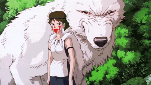
Princess Mononoke 12 Moss
Forum rules
• Posts in this forum should directly relate to the artist, art, or artwork.
• Do not post ISOs or FS/Ts in this forum section. Please use the Open Market section of the EB forums for all secondary (resale) market activity.
• Do not post details of your order process, shipping status, or condition upon arrival in this forum section. Please use the item's Release Discussion thread for this activity.
-
DarkPassnger

- Art Enthusiast
- Posts: 48
- Joined: Tue Dec 27, 2011 11:09 am
- Location: Denton, TX
"If we hit that bullseye, the rest of the dominoes should fall like a house of cards. Checkmate." - The Zapper

They're a Band Beyond Description, like Jehovah's Favorite Choir


Hi everyone I am still super pumped about getting an AP of the regular Mononoke, but was super curious what is up with the fade on the top of tree branches? It makes it look like there was a printing error or the screen did not leave enough ink when screened. I have seen this on other versions of this print and hear it is common on the Adventure Time print. Just curious if print was meant to look like that?

I have the AP and it looks exactly the same.OAFY wrote:Hi everyone I am still super pumped about getting an AP of the regular Mononoke, but was super curious what is up with the fade on the top of tree branches? It makes it look like there was a printing error or the screen did not leave enough ink when screened. I have seen this on other versions of this print and hear it is common on the Adventure Time print. Just curious if print was meant to look like that?
-
HopeThatUChoke
- Art Connoisseur
- Posts: 578
- Joined: Wed Jul 30, 2003 1:00 am
- Location: Philly,Pa
Am I the only one who hasn't received their print yet?
EDIT: Speak of the devil. It arrived today.
EDIT: Speak of the devil. It arrived today.
Last edited by HopeThatUChoke on Mon Aug 13, 2012 8:25 pm, edited 1 time in total.

Not a printing error - it's the infamous dissolve filter.OAFY wrote:Hi everyone I am still super pumped about getting an AP of the regular Mononoke, but was super curious what is up with the fade on the top of tree branches? It makes it look like there was a printing error or the screen did not leave enough ink when screened. I have seen this on other versions of this print and hear it is common on the Adventure Time print. Just curious if print was meant to look like that?
pewter14 wrote:You're not the only one on the hunt for The Thing ... just ... the most obvious ... by a lot.

This.CrustaR wrote:Not a printing error - it's the infamous dissolve filter.OAFY wrote:Hi everyone I am still super pumped about getting an AP of the regular Mononoke, but was super curious what is up with the fade on the top of tree branches? It makes it look like there was a printing error or the screen did not leave enough ink when screened. I have seen this on other versions of this print and hear it is common on the Adventure Time print. Just curious if print was meant to look like that?Many of the Mondo artists have been using it like crazy lately.
Plus, it's on the jpeg.

-
bethemonkey

- Art Expert
- Posts: 1221
- Joined: Tue Sep 13, 2011 3:57 pm
- Location: Canada EH!
Got mine today. Perfect. Olly signed in green crayon for some reason.
I'm in Canada and it costs more to ship everywhere, so get over it.


Are you interested in the Japanese lettering?
Do you have a Totoro (which version) you'd want to display side by side with it?
Do you have a Totoro (which version) you'd want to display side by side with it?
Kramerica wrote:There are a ton of really nice people who come across as complete dickheads on EB.
I have no preference regarding lettering and no, I do not own and have no interest at this time in owning Totoro (although it is pretty)tranito wrote:Are you interested in the Japanese lettering?
Do you have a Totoro (which version) you'd want to display side by side with it?
Those were good enough reasons to justify a need for the variant, but I'm not sure the colorway is one of them.
If you had a strong preference for the red/purple/pink of the variant over the green/blue of the regular, you'd already know it from the jpeg and online pics.
I take it your partial to both colorways? Then the regular shouldn't disappoint.
If you had a strong preference for the red/purple/pink of the variant over the green/blue of the regular, you'd already know it from the jpeg and online pics.
I take it your partial to both colorways? Then the regular shouldn't disappoint.
Kramerica wrote:There are a ton of really nice people who come across as complete dickheads on EB.