I think selling it would warrant a well-deserved smackdown.
I don't think that a small repro for personal 'use' is an egregious sin necessarily (like me saving a .jpeg and posting it on my desktop, sorta). but like I said before, to post it up on here is of questionable taste.
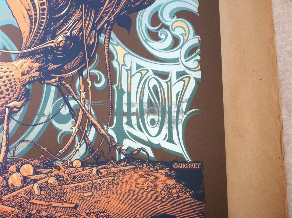
Genghis Tron Board Up the House Tour 08 Horkey
Forum rules
• Posts in this forum should directly relate to the artist, art, or artwork.
• Do not post ISOs or FS/Ts in this forum section. Please use the Open Market section of the EB forums for all secondary (resale) market activity.
• Do not post details of your order process, shipping status, or condition upon arrival in this forum section. Please use the item's Release Discussion thread for this activity.
-
ColdSoreSuperstar

- Art Expert
- Posts: 5026
- Joined: Sun Jan 15, 2006 1:00 am
- Location: I don't even know anymore.
not dead
ColdSoreSuperstar wrote:I think selling it would warrant a well-deserved smackdown.
I don't think that a small repro for personal 'use' is an egregious sin necessarily (like me saving a .jpeg and posting it on my desktop, sorta). but like I said before, to post it up on here is of questionable taste.
sorry for my english:
i reproduced genghis tron art ONLY FOR MY PERSONAL USE, i never try to sell this, i love AHorkey works and im collector too. i draw genghis tron because i try to buy this print.. [price is too higher]. if You guys dont like my work - really sorry - i never show my reproduction.

I think it's a fine drawing Carol. I see nothing wrong with copying works from artists you admire. As long as the artist is given credit which you have obviously done here. Hope you do that everywhere else too 
 X5 Hodor
-
But-we-unleashed-a-lion

- Art Expert
- Posts: 3677
- Joined: Mon Mar 26, 2007 12:00 am
- Location: Portugal
You don't have $50????
Carol please make a 180º turn and go
Bootleg people are not welcome here
If you want to show something new you've created, you are welcome and maybe we'll apreciate it
I'm sorry if I'm looking like an ass but one Kellum is enough
Carol please make a 180º turn and go
Bootleg people are not welcome here
If you want to show something new you've created, you are welcome and maybe we'll apreciate it
I'm sorry if I'm looking like an ass but one Kellum is enough

this poster is like a nipple on the surface of time. a monument of glory on the landscape of creation.
Codeblue wrote:Hork is God, Jesus, the 12 disciples, Santa Claus, and the Easter Bunny all rolled into one beautiful lanky package.
I can't remember where I saw this, maybe OMG Posters, not sure. Anyways, it's some cool info from Aaron regarding this gig poster.
An Interview with Aaron Horkey- Part Two
Written by Justin Norman Tuesday, 21 September 2010
Can you take me through the process of designing a concert poster from start to finish? I'm particularly curious how much bearing each band's music has on the design, and how involved you are with the screen printing process.
The music is of utmost importance - there have only been two or three instances where I was unfamiliar with a band's output prior to working on their poster. It felt a lot more like work and the resulting prints clearly reflect this. As for the process, I'll walk you through the Genghis Tron tour poster from 2008. The band and I had been in touch for a couple years but the timing didn't work out for a print until late in 2007/early 2008 when they were planning a record release tour for their sophomore LP, Board Up the House. I had an opening in my schedule, the record was incredible and the band understood my "no art direction" policy, so all systems were go.
Once I start in on a rock poster I don't listen to that particular band until the prints are signed and out the door. I feel like something's going to be compromised if I do - some literal visual translation will occur or some such spanner will be thrown. This is where being acutely familiar with the band's discography and outlook comes into play.
For this poster I knew going into it that I wanted to at least partially explore a merging of mechanical and organic textures to somehow mirror the music these guys create. I already had fairly fleshed out sketches of the antique microphone housing apparatus from an earlier, aborted project and thought they might mesh well with an insect of some kind. At this point I start gathering all my reference and, if photos are needed, (in this case the nail and dust covered, debris-strewn foreground) I'll shoot and print multiple angles of whatever the project calls for. By the time I start drawing up rough comps I've usually already pieced the poster together in my head, turning over each aspect of the final composition again and again until I'm as familiar with its basic "ghost" as possible so it's just a matter of stumbling through sketches until it all matches up on paper.
I typically put down 6-20 tiny, rough comps until one clicks and I'm able to build the final illustration from this loose idea. In the case of the Genghis print, the main foreground illustration and background lettering are drawn on separate plates but interact with each other on the final poster, following a basic line of movement up and away from the horizon line. Because of this I needed to draw one final refined sketch with both elements present, splitting up the lettering and illustration when it came time to transfer the art to the final paper for ink. My final pencil rough [sketches] typically include about 90% of the detail present in the finished ink work but may be only half the size. Similarly, the finished inks may be only a third or half the size of the final print, so the process from initial sketch to printed poster may involve a 500% enlargement. This is why it's so important to ensure the composition is solid from a very early stage. It really reduces headaches - especially with a deadline looming. It usually takes a good 4-5 days to get the inked drawing somewhere approaching acceptable [quality].
Once the ink work is completed I'll reduce it back down via Xerox and work up a color composite using watercolors, markers and gouache. This gives me a good idea of how many additional layers I'll need to draw for highlights, shadows, etcetera, and what color of paper I'll need to order for the prints. In this case I needed to draw two layers of highlights: a fill layer for the foreground illustration, and the “Genghis Tron” lettering that appears behind the insect. Additionally, I still had to draw the information text for the tour itself - dates, cities, flourishes - that would appear in the lower portion of the poster beneath the main illustration.
I ended up designing two separate text pieces for this poster as the first attempt was absolutely awful and really had no redeeming qualities. Once all the art is complete, everything is scanned in and assembled into a digital mock-up to ensure the various plates line up and nothing is terribly out-of-whack. Film is then output, screens are shot, and ink is mixed. I try to be present for at least part of the printing process if at all possible, either to sign off on colors or just to help rack prints, but I don't remember being around for this one until it was time to sign the band's copies. Ben LaFond handled printing duties on this one and absolutely nailed it as usual. The custom-mixed metallic green ink and split fountain lettering really turned out well on the dark brown stock, band was stoked and it was on to the next one.


Just picked up an artist edition from eBay. Print was listed as "mint condition" but seems to have some serious damage along the Tron portion of the text. Anyone know if this was a common printing issue? Looking back at the auction the damage was visible in the photos so it's partly my bust but I am curious about the damage. 
-
triporfreak

- Art Expert
- Posts: 2289
- Joined: Wed Jul 04, 2007 12:29 pm
- Location: NorCal
i've had multiple copies of GT over the years & never saw one like that. some issues in the screening process, i suspect. should've been disclosed.
-
greenhorn1

- Art Expert
- Posts: 8790
- Joined: Tue Jun 06, 2006 12:00 am
If that's a S/N print there's no way it was like that upon editioning. I would definitely say it should have been disclosed.
ISO Horkey Stacy Lowery Paleo Deck. $$$$$$$ (or trade)
-
greenhorn1
- Art Expert
- Posts: 8790
- Joined: Tue Jun 06, 2006 12:00 am
yeah that print definitely got mishandled somewhere along the line. If it was described as MINT, then you got screwed. I always feel bad when the damage was visible in the pictures and I just didn't notice it though. Hopefully you can come to some sort of amicable resolution with the seller though.
ISO Horkey Stacy Lowery Paleo Deck. $$$$$$$ (or trade)
